Molteni&C inaugurates
Molteni Pavilion
A major expansion of about 1,400 square metres has reconfigured the geography of Molteni&C’s headquarters, an emblem of the DNA and values of the historic Giussano based company and a further milestone in the Group’s growth and internationalisation strategy.
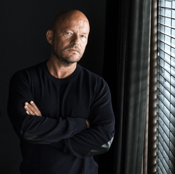
A major expansion of about 1,400 square metres has reconfigured the geography of Molteni&C’s headquarters, an emblem of the DNA and values of the historic Giussano based company and a further milestone in the Group’s growth and internationalisation strategy.
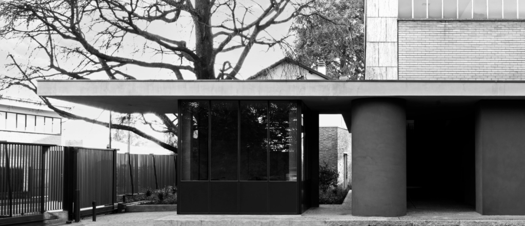
The Molteni Compound expansion project by creative director Vincent Van Duysen comes a few years after the interventions that reconfigured the layout of the premises, including the showroom and the main entrance, between the mid-1980s and the 1990s, and marks the first Van Duysen-designed architectural project within the company’s boundaries.
The original layout dates back to early 1950s architectural designs, of which the grand staircase, façade cladding and typical window frames are still preserved. The round pillar positioned at the entrance is a clear Rossi architectural trademark, which is also found in the Aurora house in Turin or in the Villalba unit, while the showroom, designed in-house by Luca Meda, is minimal in its linearity and conceived to emphasise the individual design pieces. Over time it will undergo further interventions, creating continuously new settings, capable of restoring the warmth of the Molteni&C house.

This Compound bears witness to the passage of time and to the great names in Italian and international architecture and design, and today, thanks to a substantial investment, tells of important new developments.
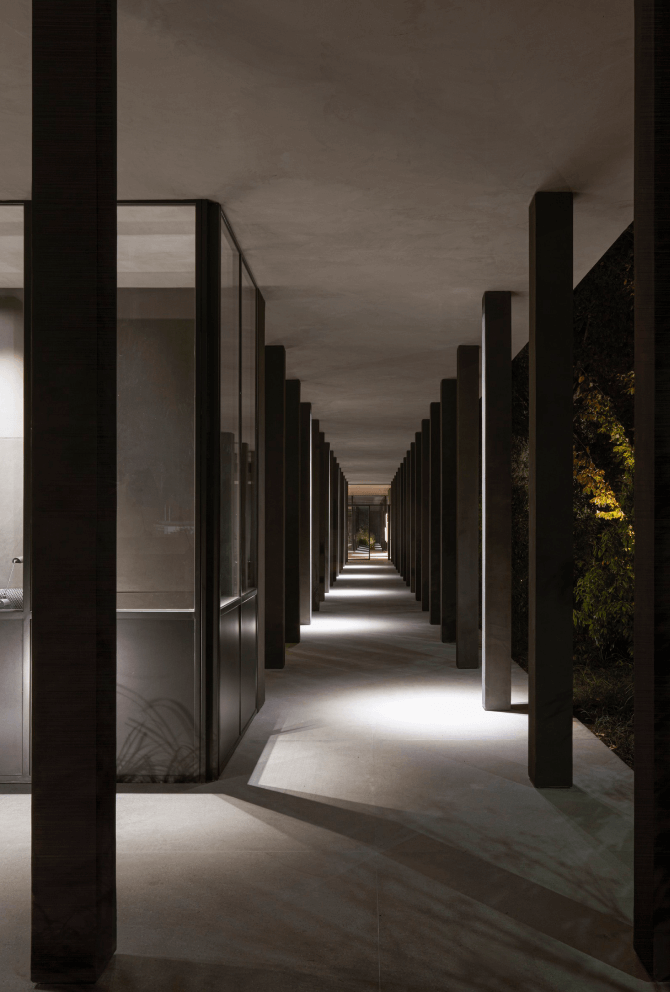
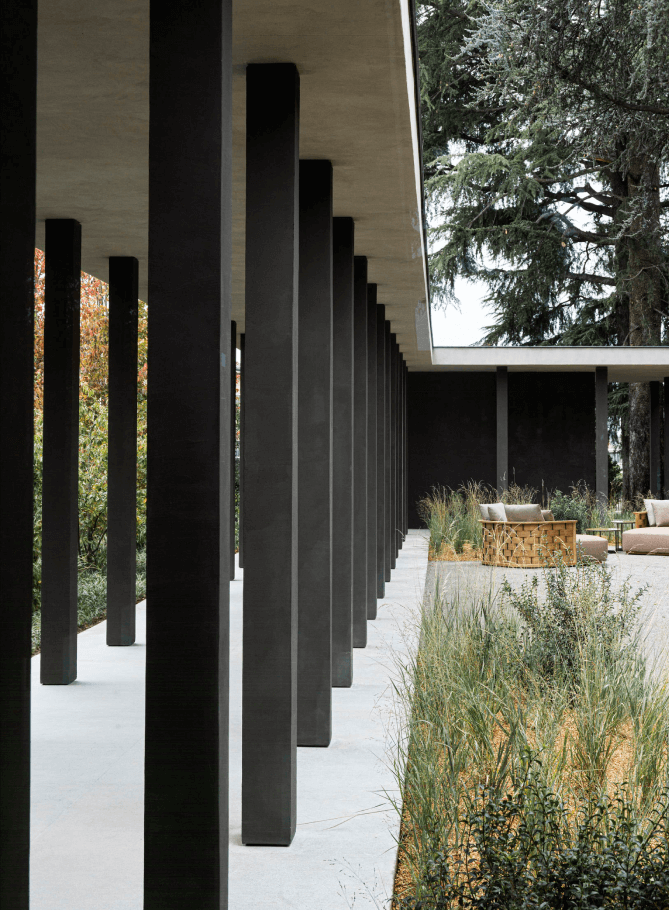
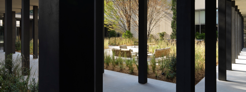
Cloister-like courtyards accompany the visitor on an imaginative journey into the heart of the company. The corporate guest entrance has been redesigned, with a new reception building that incorporates columned paths that punctuate and filter the view of the garden and guide the visitor into the company’s interior, where the elements of the new Molteni&C | Outdoor proposal are arranged like sculptures, integrating with the greenery.
The natural design was entrusted to landscape architect Marco Bay, who created veritable open-air rooms with a soft and natural presence of greenery.
“The expansion of the Compound represents the Molteni Group’s determination to provide an all-round holistic experience for visitors. The new annex areas bring a breath of innovation and modernity to the headquarters.” The project “stems from the idea of creating a continuous dialogue between domestic and open spaces. This is why, in addition to the new Pavilion and the transformation of the existing ground floor, I wanted to place great value on the exterior”
Vincent Van Duysen
“An environment in which the natural element is free to express itself through shapes, heights, textures and dynamism. Here are two “rooms” in which the course of time will create haphazard vegetation, which will act as a backdrop and soft embrace for furnishing elements and new decor ideas”.
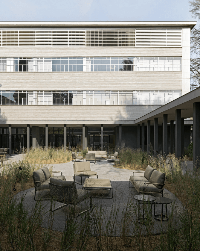
Two large horizontal concrete elements, the floor and the ceiling, supported by the colonnade, lead to the Pavilion. This is a multifunctional building also designed with the new needs of smart working in mind; a place of work and transit, which in addition to the simple volumes, combines large glass surfaces of modernist influence.
Inside the Pavilion, in addition to the reception area to welcome guests and visitors, there is a hospitality area, designed to host them. It is based on the structure of a real restaurant, with fully glazed walls that open onto the outside for an engaging experience in all seasons.
The furniture is designed specifically for the environment by Vincent Van Duysen: in the restaurant area there are benches inspired by the Paul sofa, tables specially designed for the space and Janet chairs. The custom-made lamps are produced by Nemo Lighting according to a design by the Belgian creative director.
The mise en place is the responsibility of Csaba della Zorza, an expert in the art of table presentation, selecting of individual objects in perfect consonance with the aesthetic vision of the designer and the brand. The aim was to create an atmosphere of Italian hospitality; both elegant and understated. Only natural materials were used, in harmony with the restaurant’s architecture.
The food proposal is entrusted to Vicook, a company from Bergamo whose trademark is its ongoing research in the food & service sector, the excellence of its products and the provision of a unique culinary experience. To guarantee quality, the Cerea family oversees the three-starred Da Vittorio restaurant. The journey of discovery into Molteni&C continues in the Luca Meda room, also refurbished, with boiserie walls and an elm-coloured ceiling that harmonises with the dark tones of the external colonnade.
For the presentation of the Outdoor proposal, the room is hosting a special installation by Stefano Baccari, landscape and garden designer. Tubs with sinuous lines showcase the most iconic products of the new line dedicated to the outdoors. Aquatic plants are emphatically dotted around the water mirror, creating a suspended atmosphere, also accompanied by a special soundtrack with a natural evocation, created especially for the occasion by the Soundmark studio.
Stefano Baccari’s proposal “represents a mediating space between the outdoor courtyard and the indoor space. It is a play of display volumes that complements without overpowering, echoing the colours of the collection in warm earth tones in great harmony thanks to the natural element”.
